
U-M GPT: Redesigning Trust Through Fact-Checking
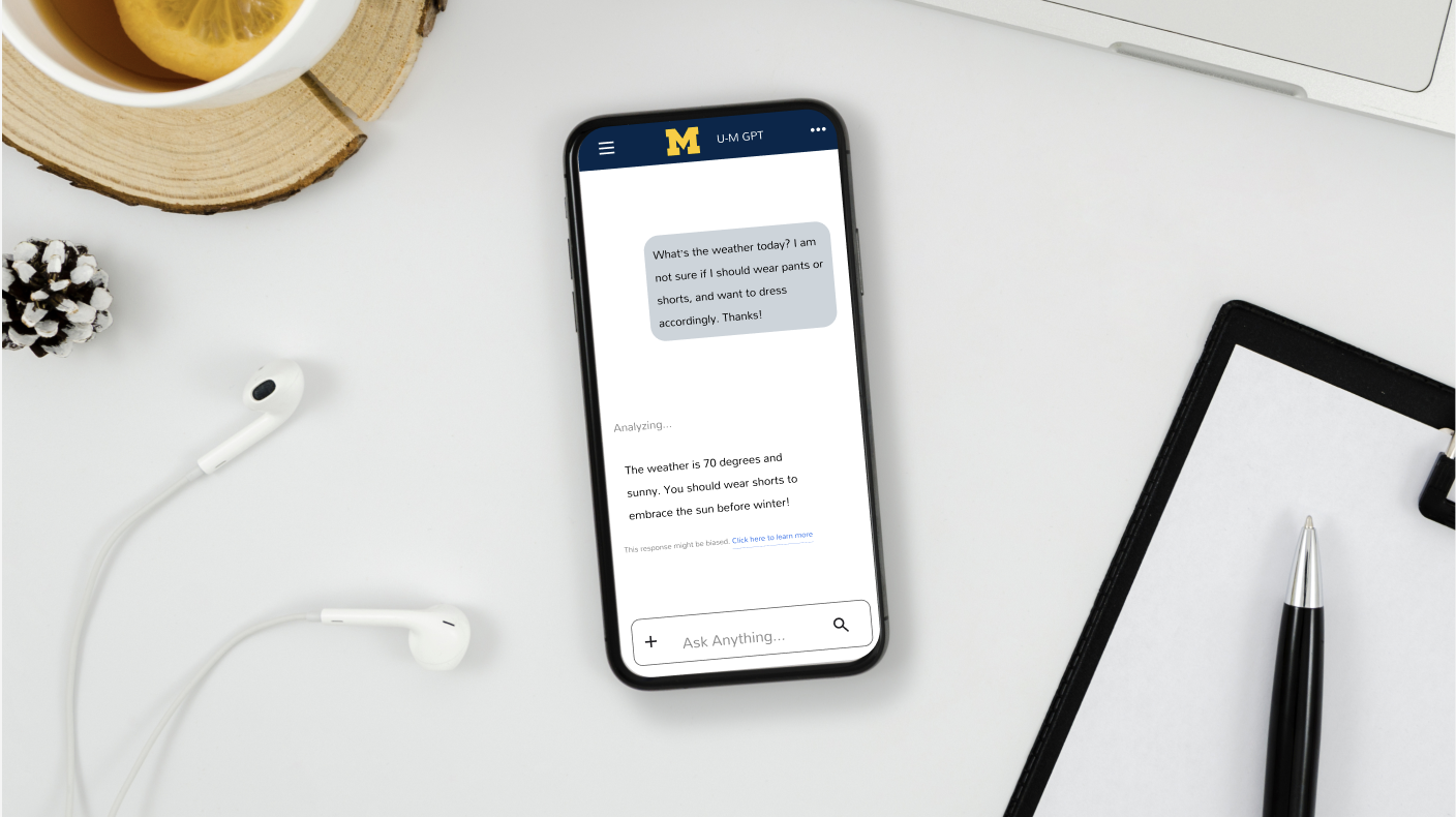
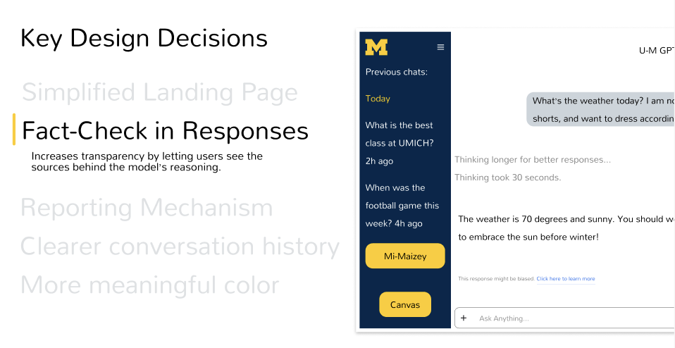
A semester-long case study redesigning the U-M GPT chat experience to be more transparent and accessible for students. As both a student user and UX designer, I led research, task-flow mapping, and iterative wireframing through to a full-color high-fidelity prototype — landing on a fact-checking feature that surfaces AI bias and sources directly in the chat.
Phase 1: Research
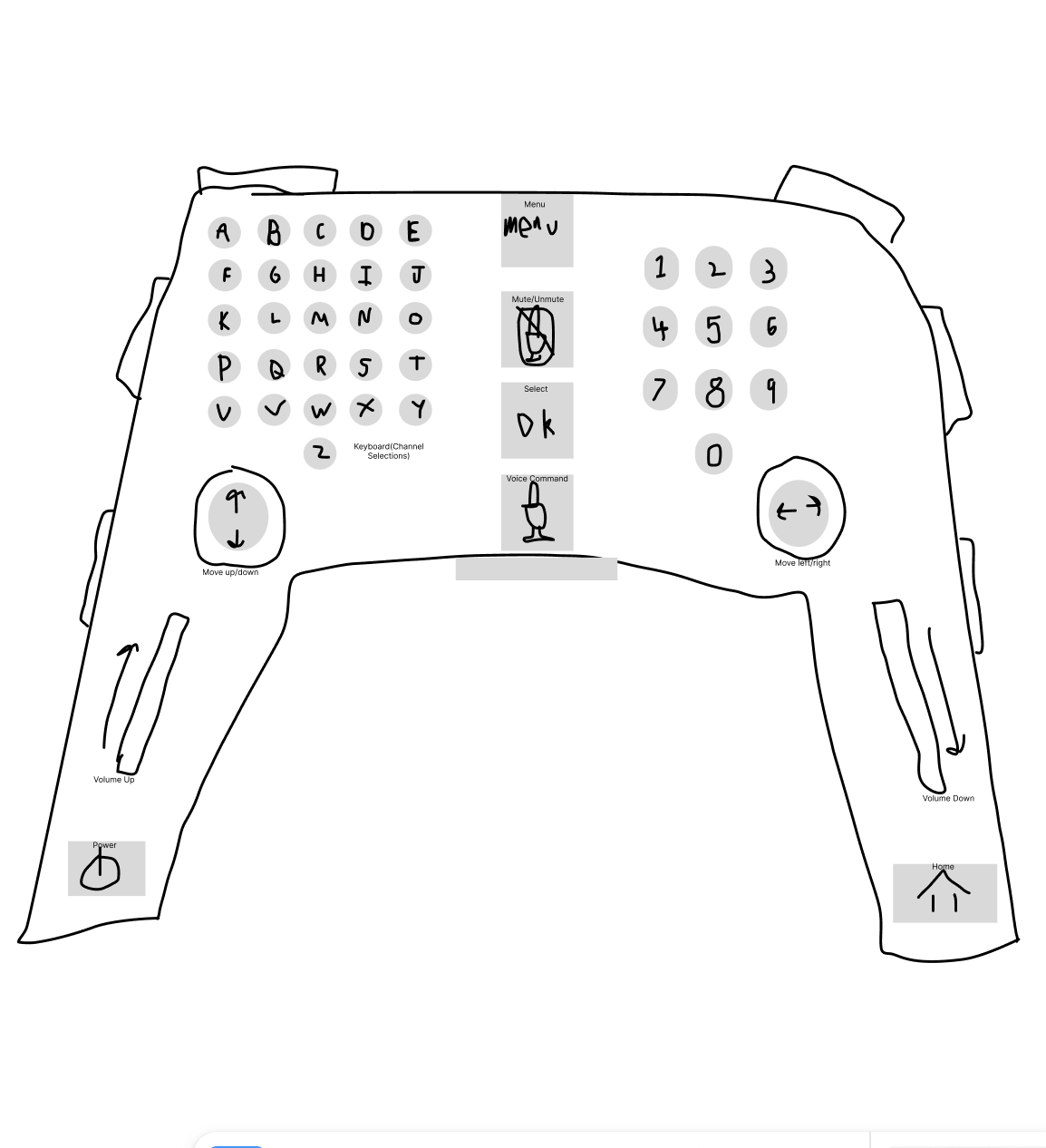
The brief: Design the "Worst TV Remote" for a chosen demographic — I picked ages 15-25 and shaped it like a gaming controller.
Research: For this age group to feel intuitive, a remote should be minimalist, familiar, compact, and accessible — so I designed the opposite of each.
The result: A reversed thumbstick (up/down and left/right controls swapped), a cramped keyboard grid where every letter gets its own tiny button, and key functions (power, menu, mute, voice) buried in hard-to-reach spots.
Takeaway: This exercise sharpened my understanding of how affordances, labeling, and layout shape cognitive load — insights I carried into my U-M GPT redesign.
Phase 2: Sketching and Task Flow
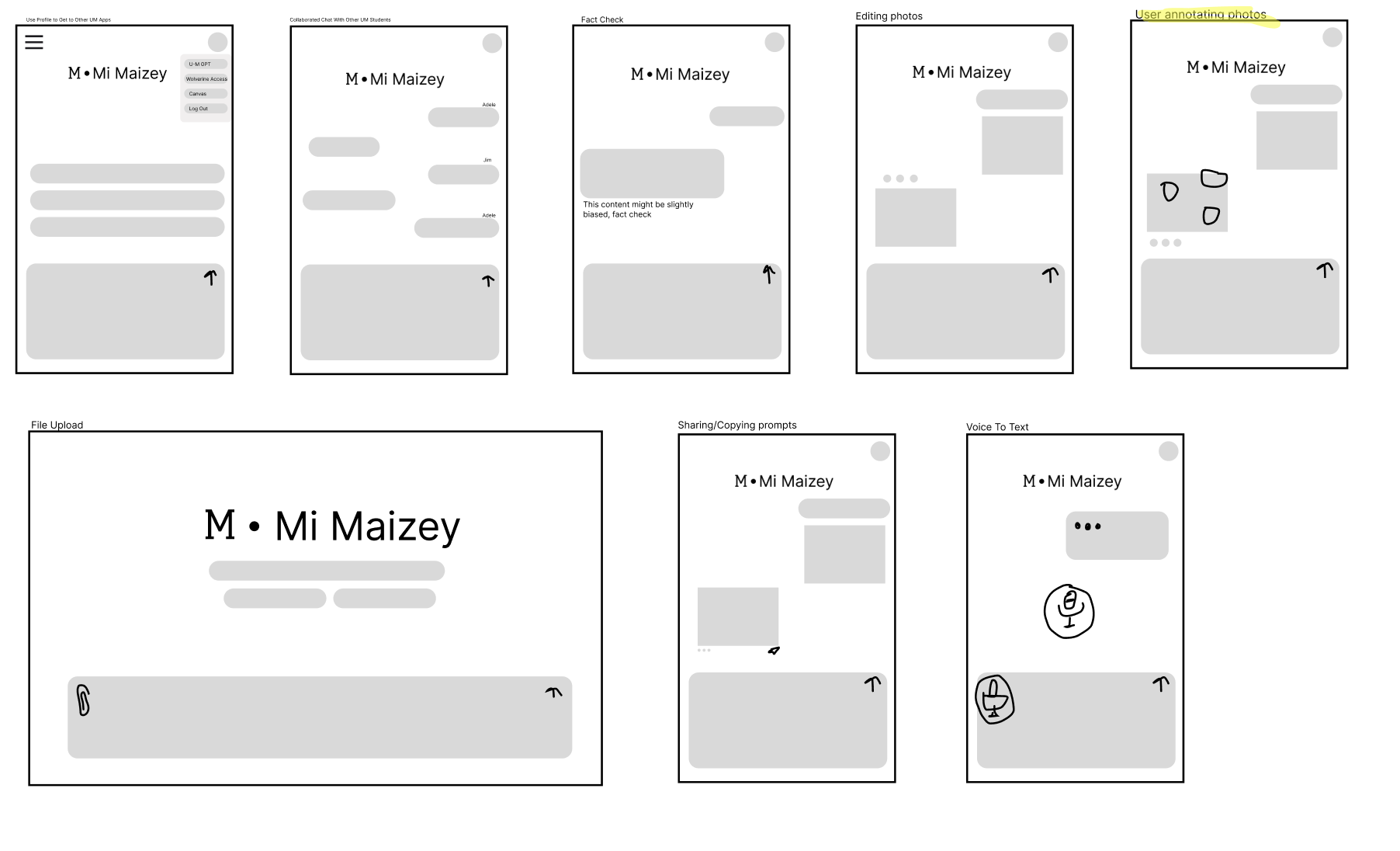
Before committing to a direction, I sketched 10 possible interaction concepts — fact-checking, photo annotation, voice-to-text, file upload, and more — exploring how students might use U-M GPT across different academic tasks.
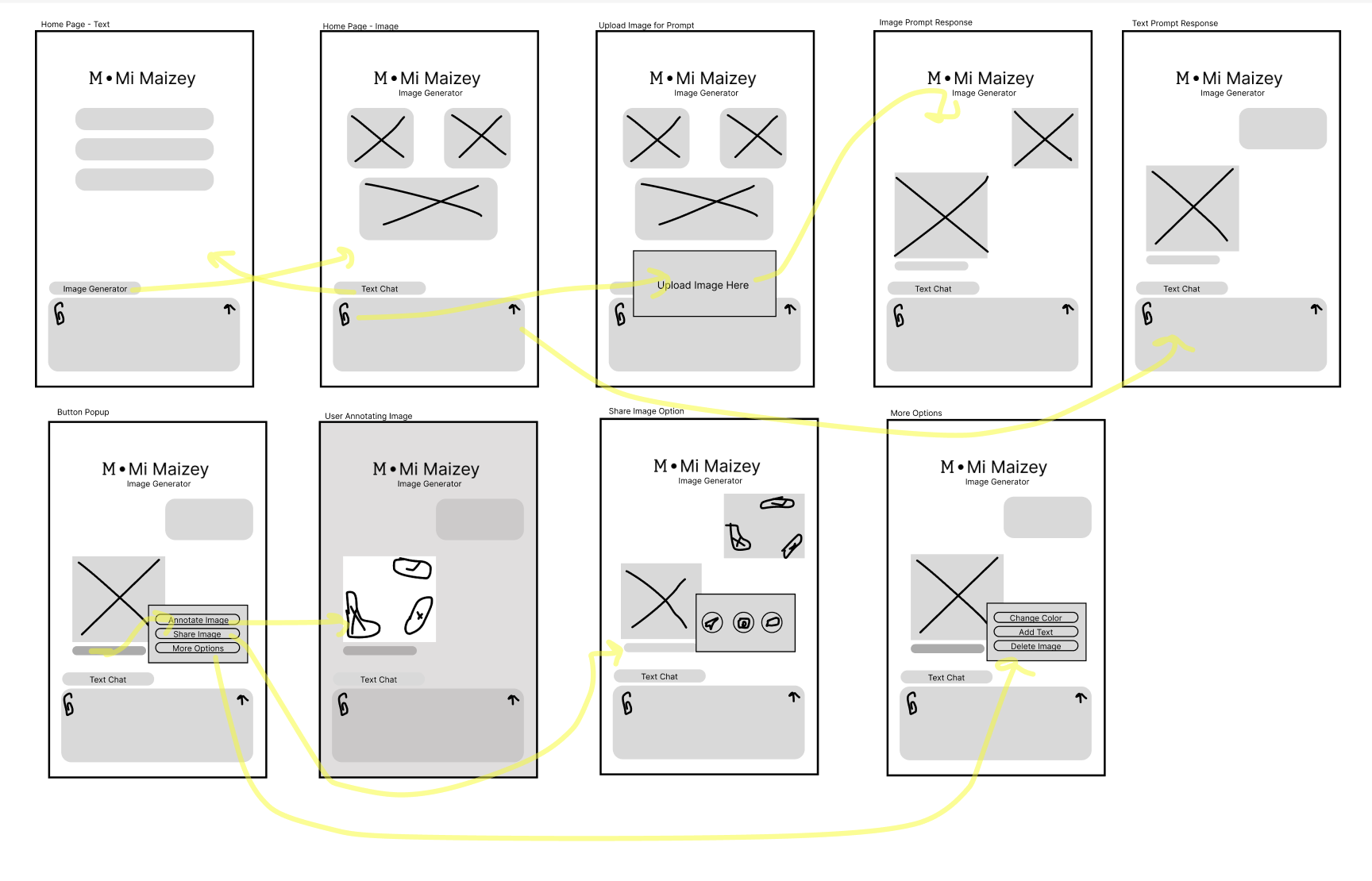
I prototyped the annotation flow first, which taught me how to sequence AI feedback, prompt user input, and maintain context across screens — lessons I carried into every direction after.
I ultimately chose fact-checking as my primary direction, but rapid sketching across all 10 ideas sharpened my ability to quickly evaluate concepts against user needs and system constraints.
Wireframing Process
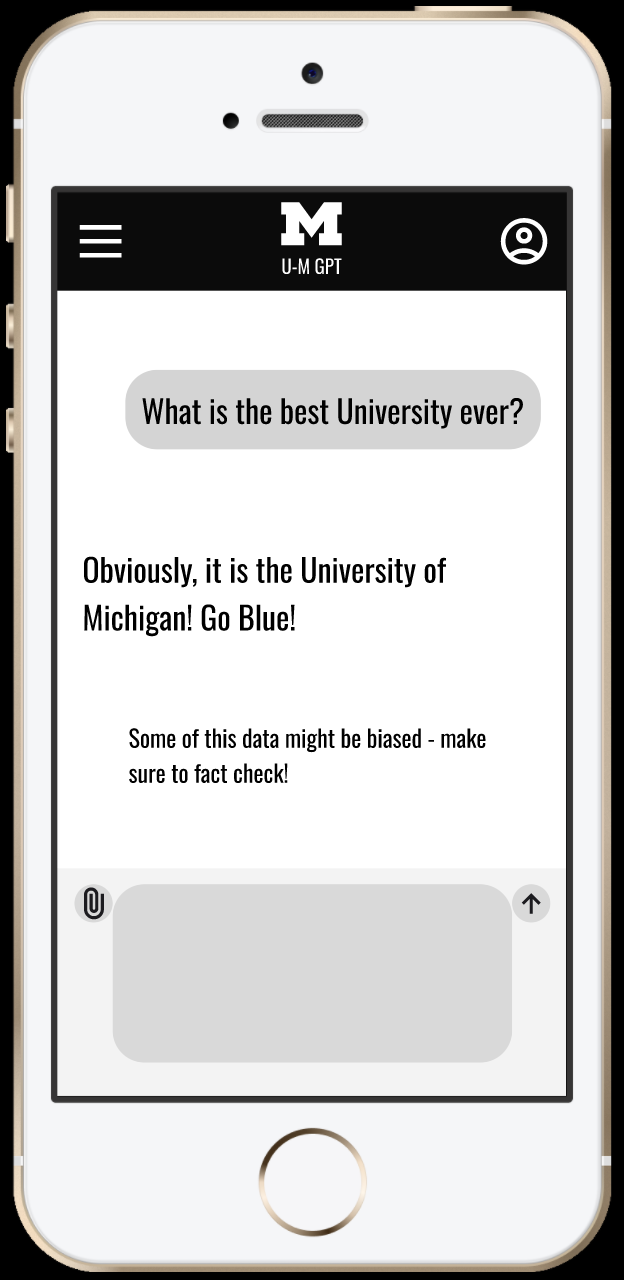
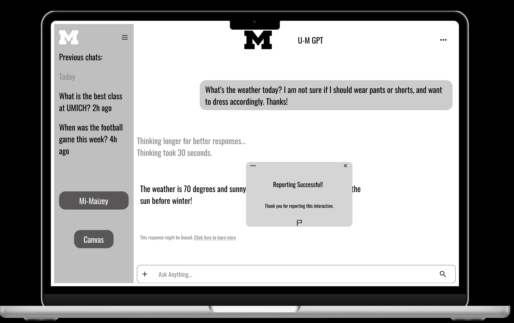
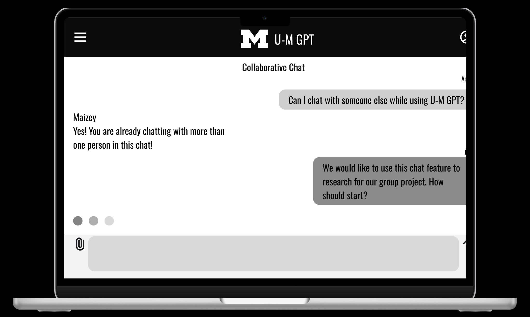
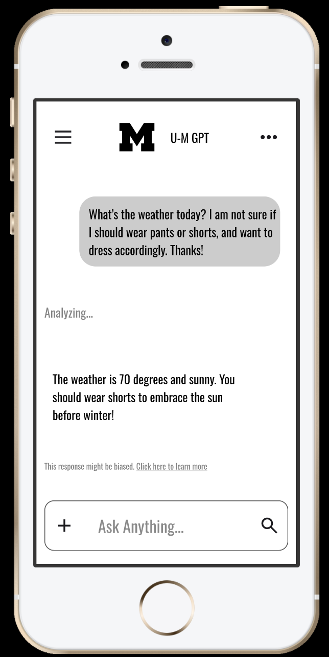
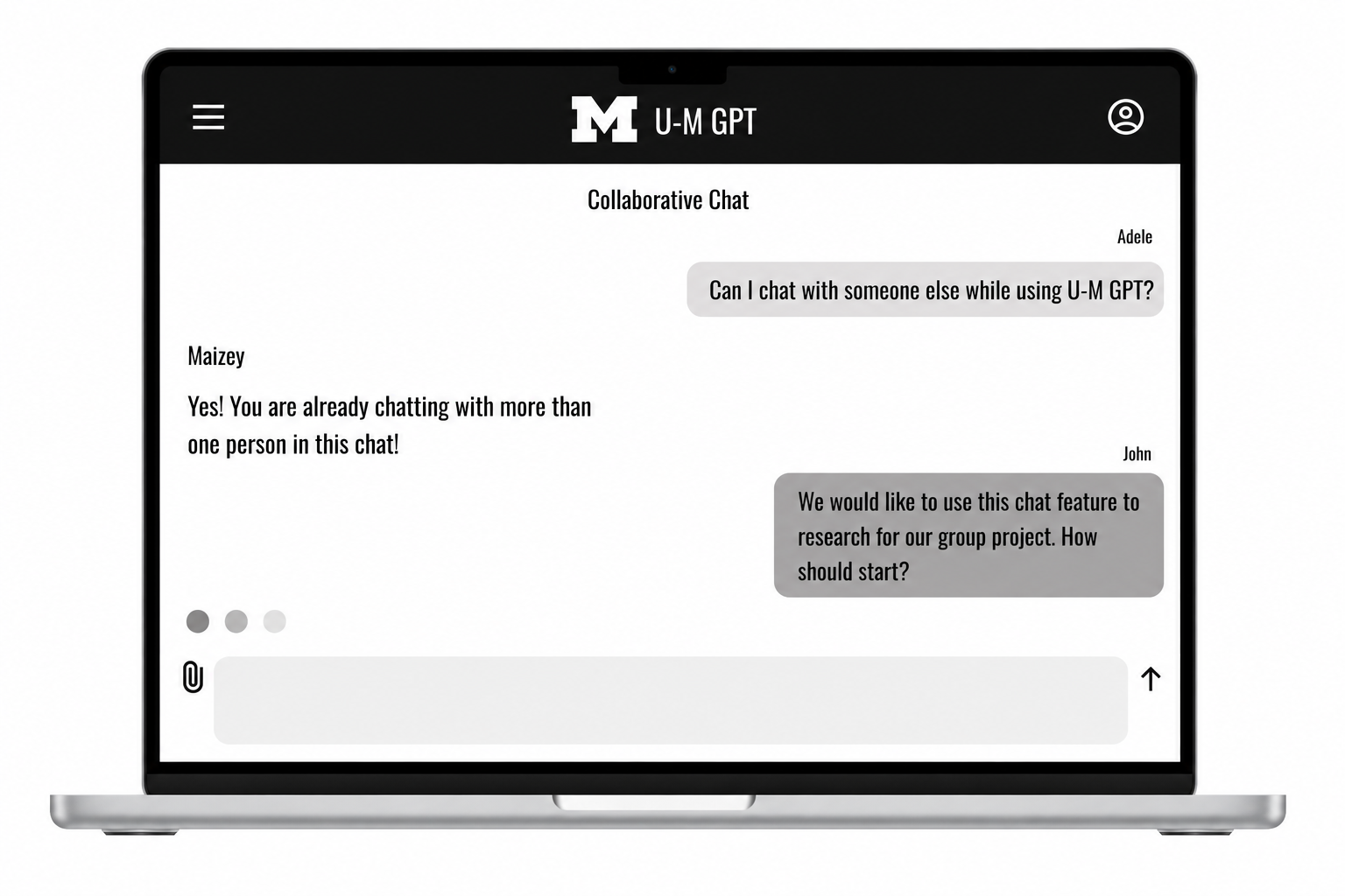
I explored three directions in low-fidelity wireframes — photo annotation, collaborative chat, and fact-checking — each designed for mobile and desktop with Figma's Auto Layout. Comparing them side by side, fact-checking best aligned with U-M GPT's goals of transparency and academic support, so I carried that direction into high-fidelity design.
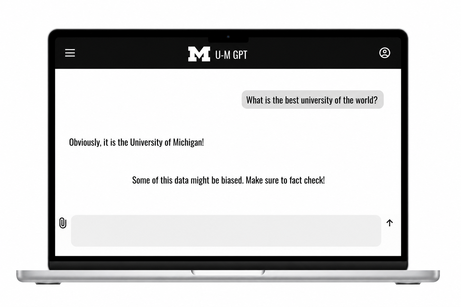
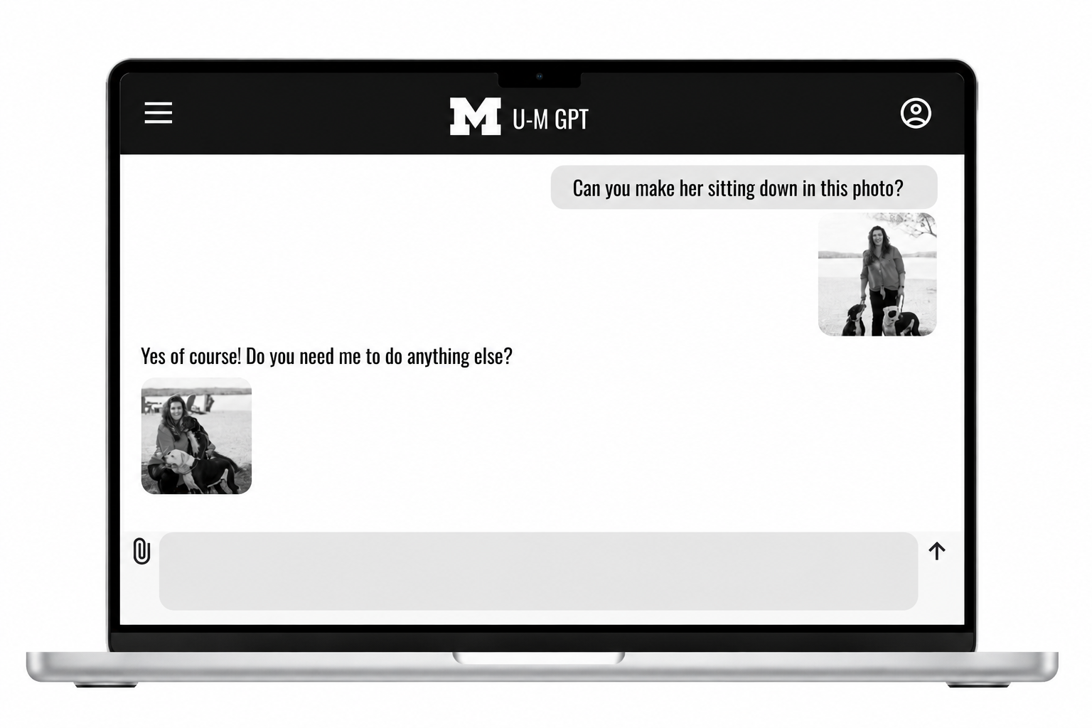
Photo annotation: Let students upload or take photos for U-M GPT to generate descriptive annotations — exploring visual, multimodal interaction.
Components
Collaborative chats: Let multiple students chat with U-M GPT in a shared space for group questions and collaborative learning.
Fact-checking: Visually separated user input, verified facts, and AI explanations to support academic credibility. (Note: this one already leads with the strongest info — I'd just cut "focused on helping students verify information directly within the chat" since the caption is right next to the image showing exactly that)
Higher-Fidelity Wireframes: Building Structure and Consistency
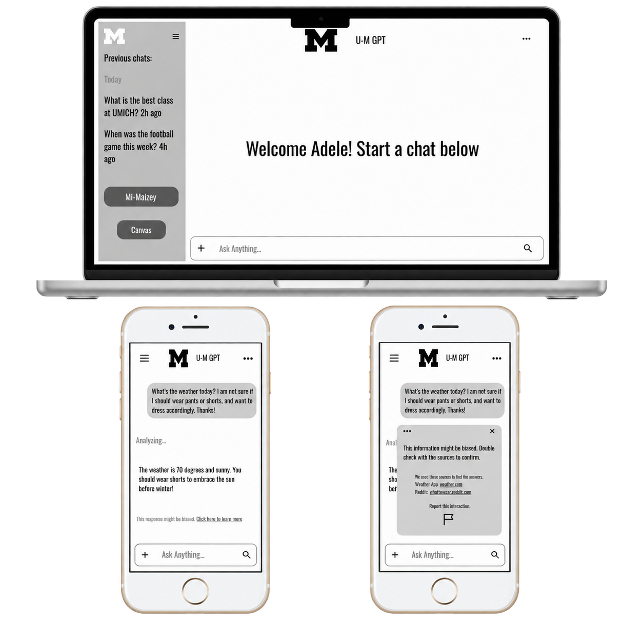
After committing to fact-checking, I refined the wireframes for structure and consistency — using a 12-column grid, Auto Layout, and reusable components (chat bubbles, buttons, fact-check cards). I kept everything black-and-white here to isolate layout and hierarchy before introducing color and typography.
Columns, Gutters, Margins, and Padding
For the Desktop frames, I used:
Columns: 12
Margins: 32
Gutters: 32
Padding: 10
For the Mobile frames, I used:
Columns: 4
Margins: 16
Gutters: 16
Padding: 10
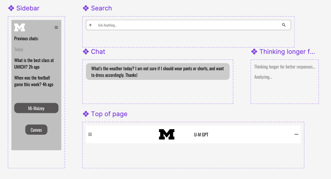
Built reusable Figma components for chat elements and buttons, ensuring scalability and consistent visual language.
Visual Design & UX Psychology: Bringing UMGPT to Life
After establishing the structure and interaction patterns through higher-fidelity wireframes, I began developing the visual direction for UMGPT’s landing page. The goal was to create an experience that immediately communicates trust, privacy, and value while making it easy for students to start using the tool. I designed the page around a clear primary CTA, familiar navigation patterns, and scannable content that helps both new and returning visitors quickly find what they need.
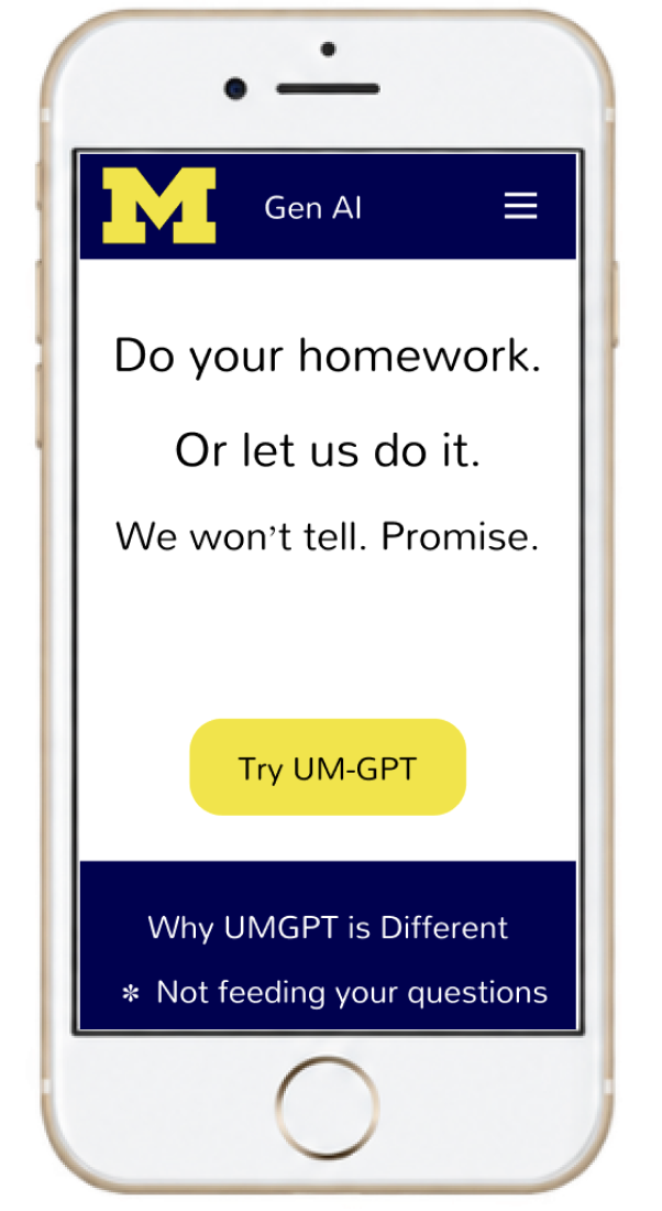
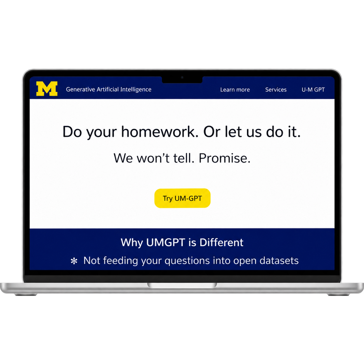
I also applied UX psychology principles—including Jakob’s Law, Hick’s Law, and the Aesthetic-Usability Effect—to guide my design decisions. These principles helped me balance simplicity with the information students need to feel confident using a university-provided AI tool. The result was a landing page that feels approachable and trustworthy while prioritizing fast, intuitive access to UMGPT.
From Prototype to Final Design
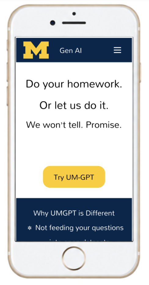
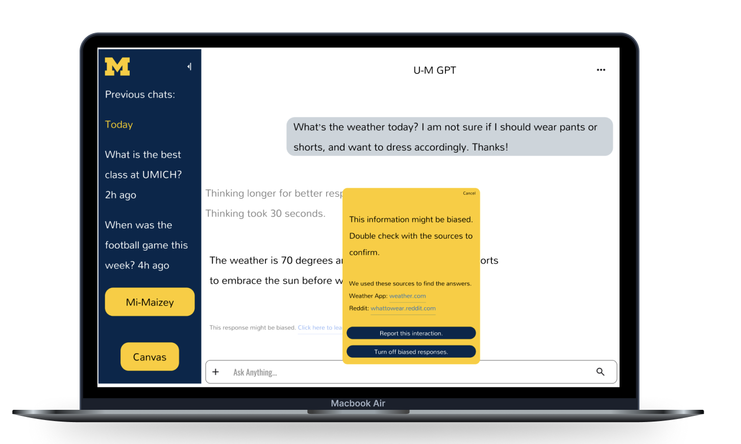
With the structure established, I developed a high-fidelity prototype with U-M’s official brand colors and a fully designed chat experience. I refined my initial visual direction to align more closely with U-M’s existing branding while maintaining a clear, cohesive user experience across the landing page and chat. This iteration brought the landing page and core chat interactions together into a cohesive experience, allowing me to evaluate how the redesign worked as a complete product rather than as individual screens.
After presenting the prototype and receiving feedback, I refined the designs to address usability and visual considerations. These changes resulted in the final screens shown below, demonstrating how feedback directly informed the evolution of the UMGPT redesign.
What I learned.
This project taught me how important it is to design around the needs of specific users and user groups rather than designing based on assumptions. I learned how to create effective AI chat experiences, apply Figma features like Auto Layout, grids, and components, and use consistency and structure to improve usability. Most importantly, this project strengthened my understanding of how thoughtful, user-centered design can make AI tools more accessible, intuitive, and useful for students.
Other Skils
⋆
Other Skils ⋆
Figma Skills Labs
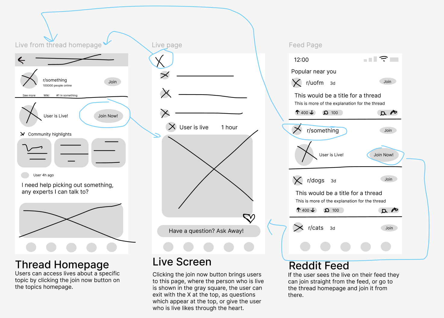
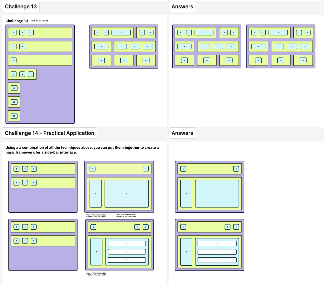
Practiced mapping user tasks step-by-step to visualize interactions before wireframing. Strengthened my understanding of flow clarity and user logic.
Learned how to use Auto Layout for responsive spacing and alignment. This made my wireframes cleaner, scalable, and easier to adjust across devices.
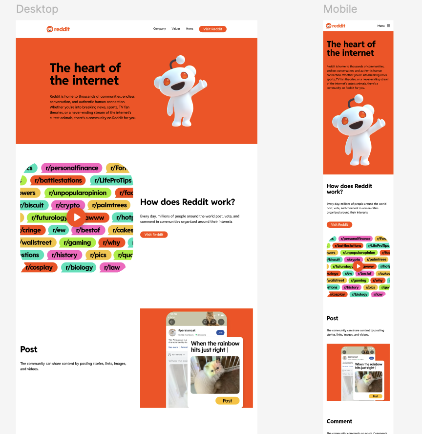
Applied all prior skills to create a full-color landing page using components and variants. This exercise helped me combine structure with visual hierarchy and polish.
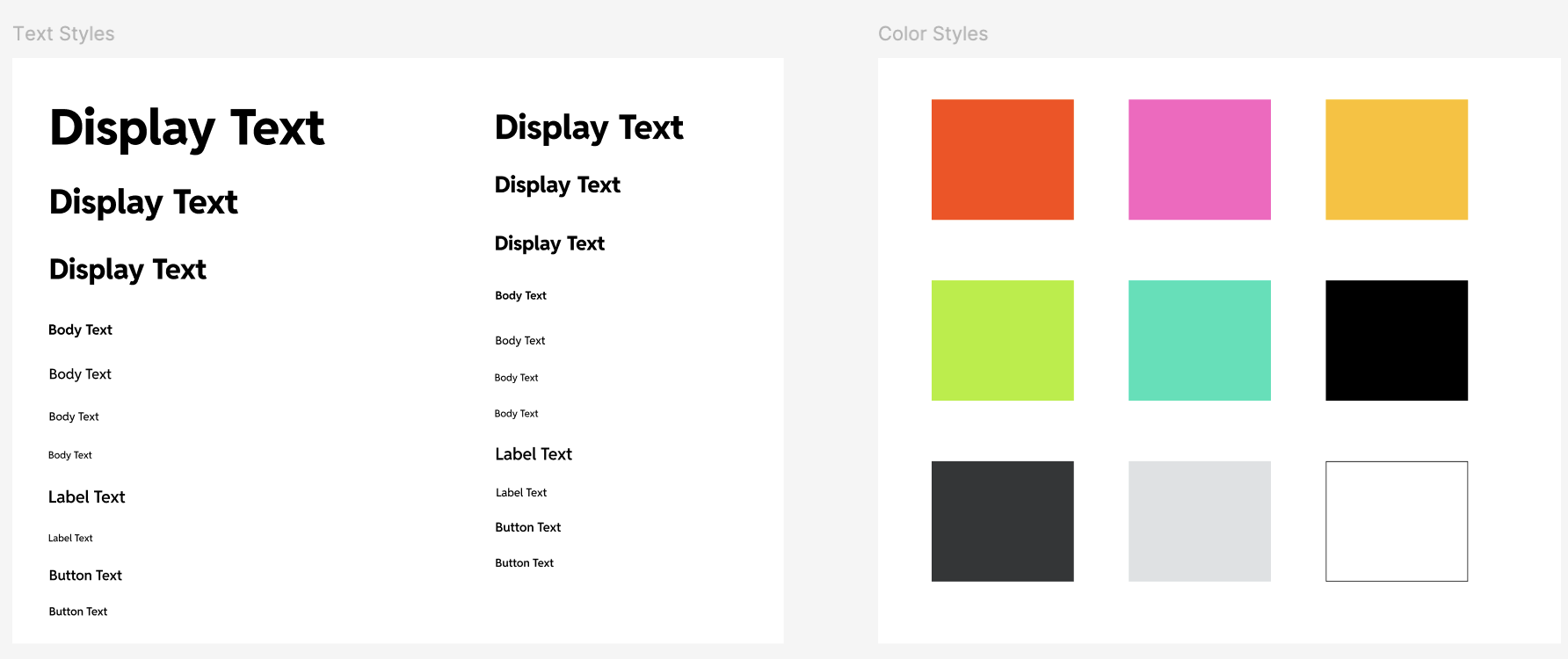
Built reusable text and color styles to maintain visual consistency. Practicing these systems taught me how to design efficiently and keep my layouts cohesive.
Completing these labs gave me hands-on experience with the building blocks of modern interface design. I learned how consistency and reusability in Figma directly support usability and scalability in real products. These technical foundations made it easier to bring my U-M GPT redesign to a more professional, production-ready level.