
MPTDesigns
My goal was to modernize the interface, make it usable across all devices, and give the business owner the flexibility to expand into e-commerce in the future. The redesign focused on improving layout consistency, enhancing product visibility, and creating a cleaner, more elegant look that reflects the custom clothing brand.
Role: UX Designer
Responsibilities: Discovery, User Research, Wireframes
Time: June - August 2025 (Continuing on my own October 2025 - Present)

My process
Met with the owner to identify her goals and content needs.
Compared her site with other e-commerce brands to study layout patterns and visual design trends.
Created initial sketches to explore different homepage and product display options.
Translated the most promising sketches into wireframes that balanced usability and brand expression.
Research Goals:
Understand business needs and pain points from the company owner
Evaluate the current website experience on desktop and mobile
Identify barriers preventing users from finding information or contacting the business
Determine expectations for future growth (e-commerce, professionalism, trust)
From the business owner:
Website was not currently in use and not generating leads
A domain exists, but no real platform or analytics
Wants a trustworthy, professional online presence
Interested in future e-commerce features (ex: company store)
Business historically grown 100% by word-of-mouth
Priority: simple, easy to maintain, room to expand
“I don’t currently use my website for anything. Ideally, it should be professional and trustworthy, with room to grow.”
Research Methods:
Founder Interview
Conducted via email and in-person meetings to understand business goals and current frustrations.User Interviews
Spoke with multiple customers and website visitors to learn about usability challenges and navigation pain points.Heuristic Review & Competitor Scan
Assessed the existing digital presence and compared to similar local businesses (optional to include if accurate).
From users:
Mobile experience was difficult to navigate
The site felt like an e-commerce store, but there was nothing to buy
Too many links and categories → cognitive overload
Users didn’t know the next step (contact? order? learn?)
Hard to quickly understand what the business does
“The mobile site is hard to use. It feels like a store, but you can’t buy anything. There are just too many options, and I don’t know what to do next.”
From my research:
No clear primary action → Users leave without contacting the business
Confusing navigation → Frustrates users; hard to find information
Unclear value proposition → Reduces credibility
Mobile not optimized → Poor experience on phones
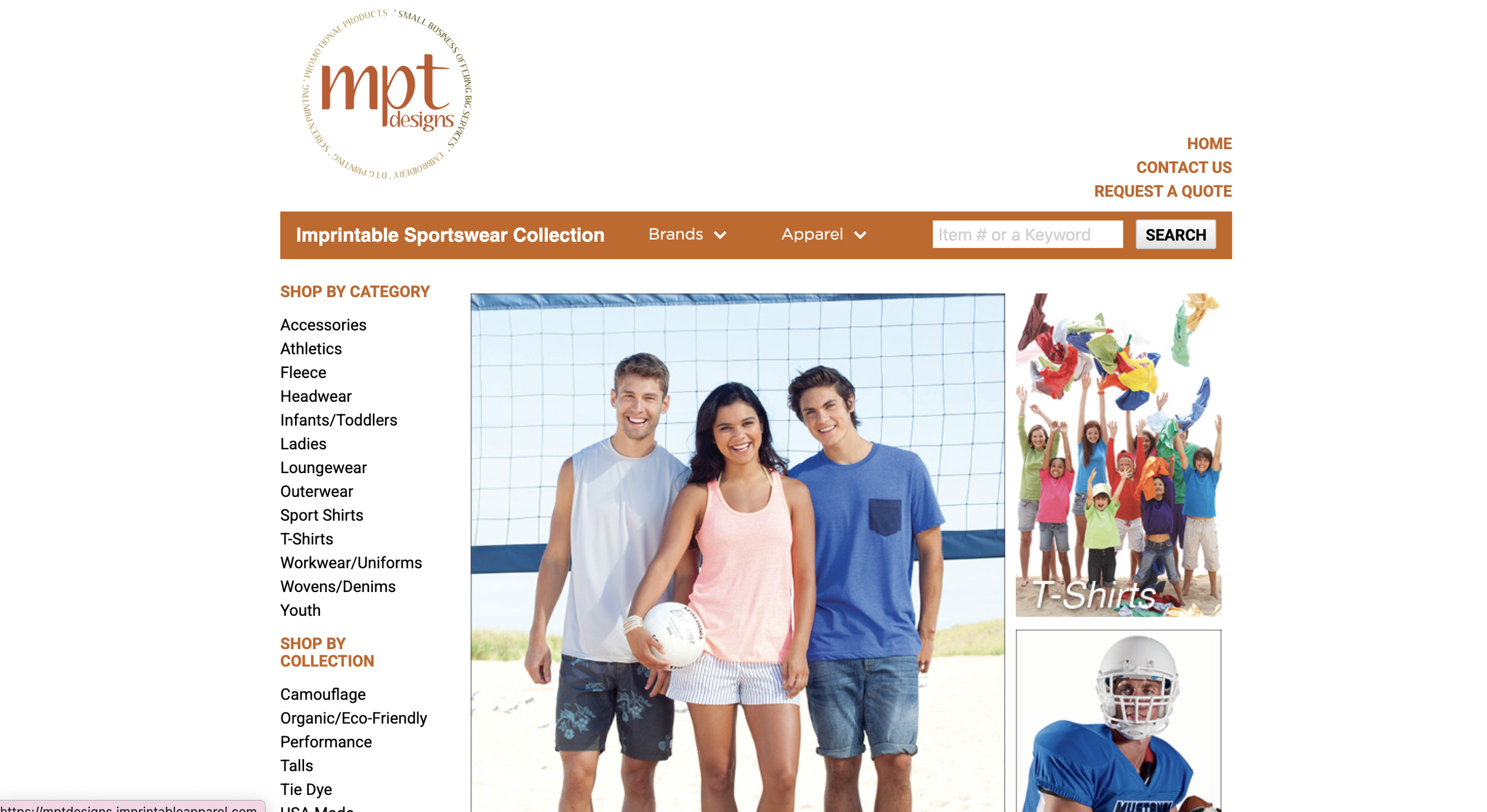
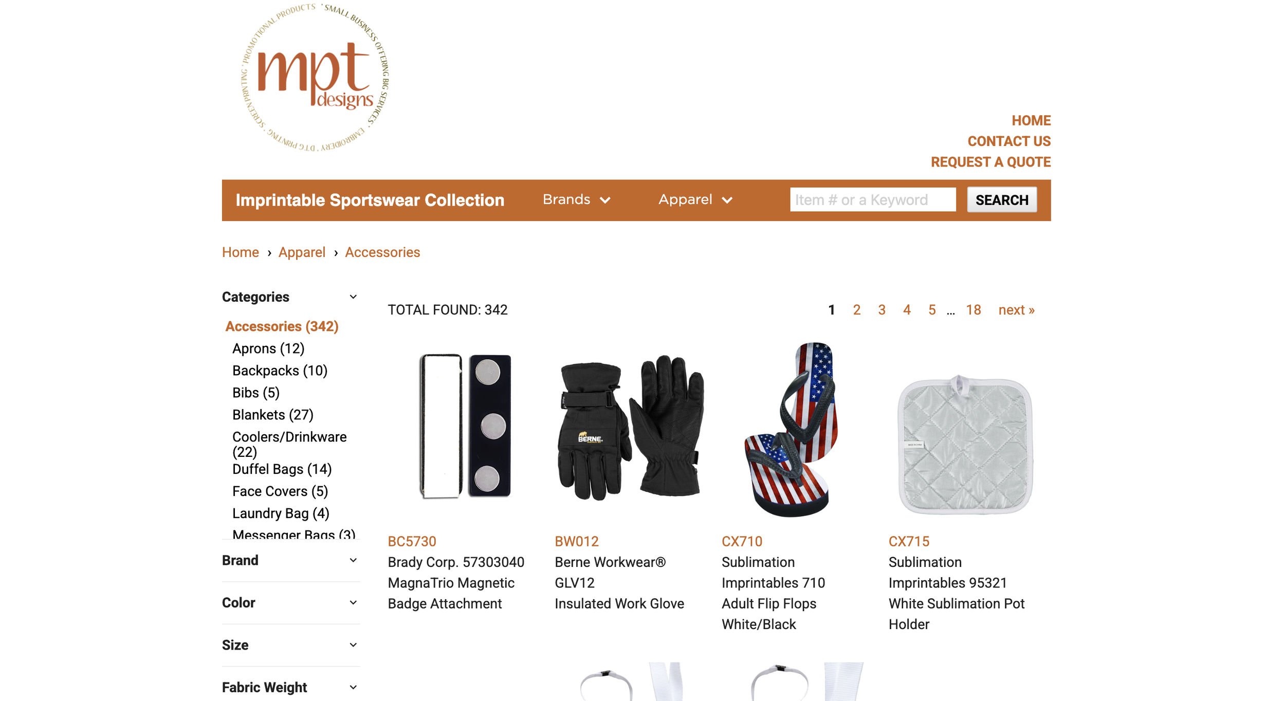

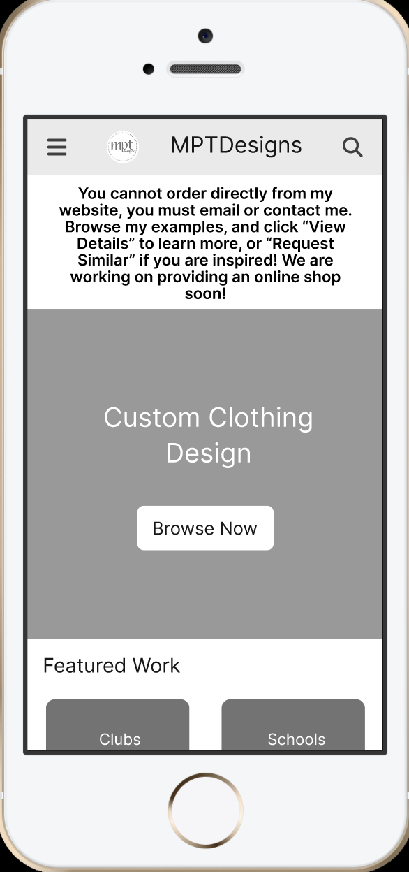
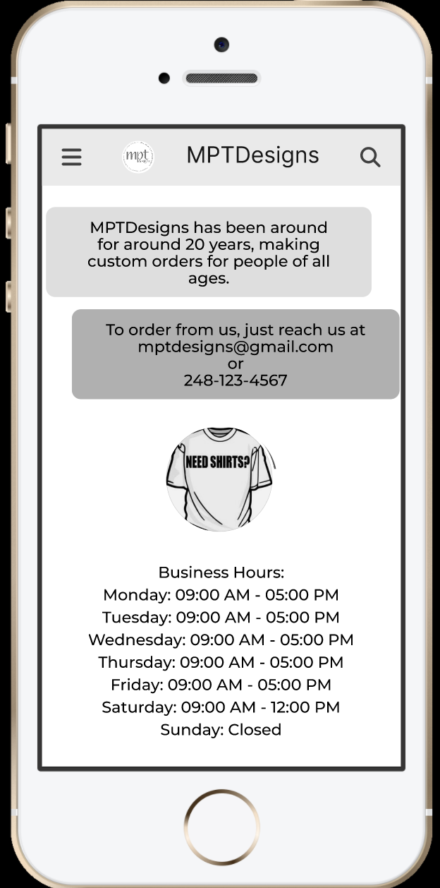
These three images here are screenshots from the website. The website did not take up the full screen, so there was always excess white space on the sides of the website. It was also unclear where the users were supposed to go once they were on the home page (the page on the left). While the site was set up like an e-commerce website, the users could not fully order off the website, as you can see with the page on the right.

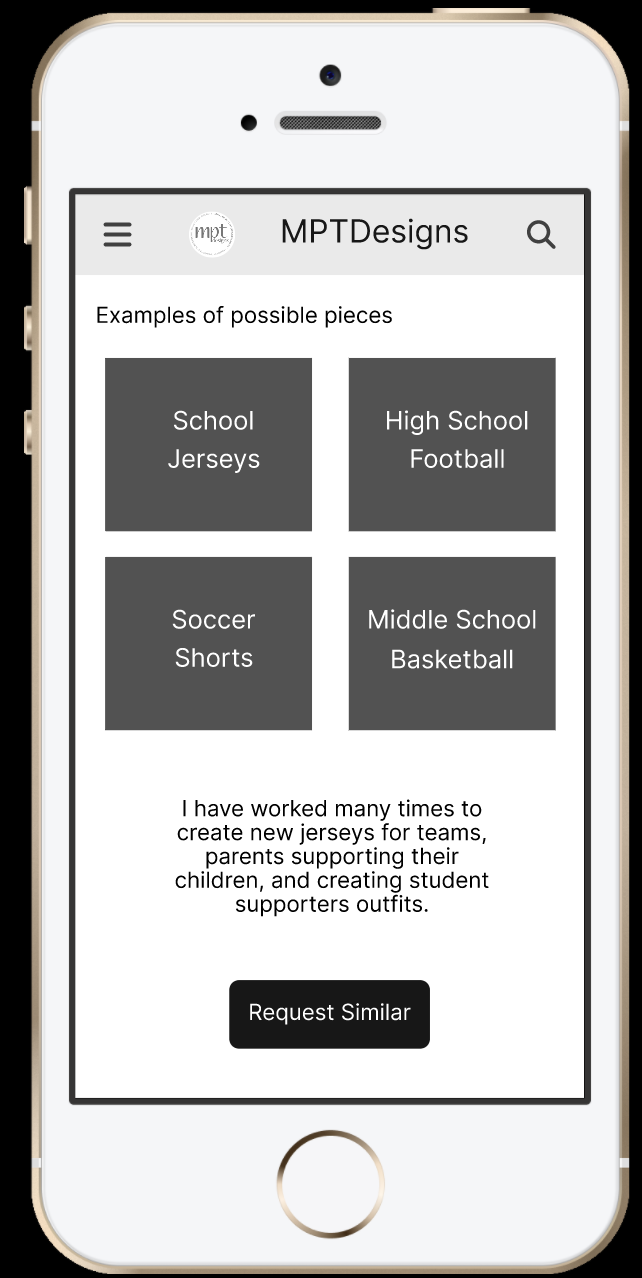
Expanding the Site With Real Value: Showcasing Past Work
During our discussions, the business owner expressed that much of her work comes from word of mouth, and potential customers often want to see examples before placing an order. To support trust and lead generation, I introduced an entirely new content strategy:
Highlight completed projects to build credibility
Allow users to request similar items quickly
Create visual pathways into products and services
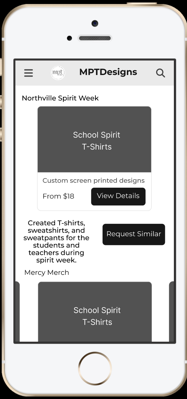
I designed three example portfolio pages based on her most common order types:
School Spirit Apparel
→ Hoodies, shirts, fan gear with school colors and mascots
→ Quick “Request Quote for My School” actionSports Teams
→ Custom jerseys, warmups, banners
→ Request: “I want this for my team”Work Merchandise & Uniforms
→ Company-branded apparel & accessories
→ Request: “Start a company merch order”
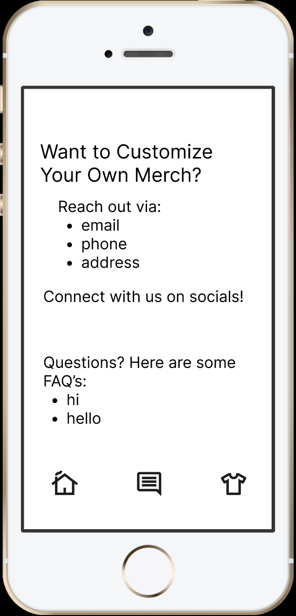
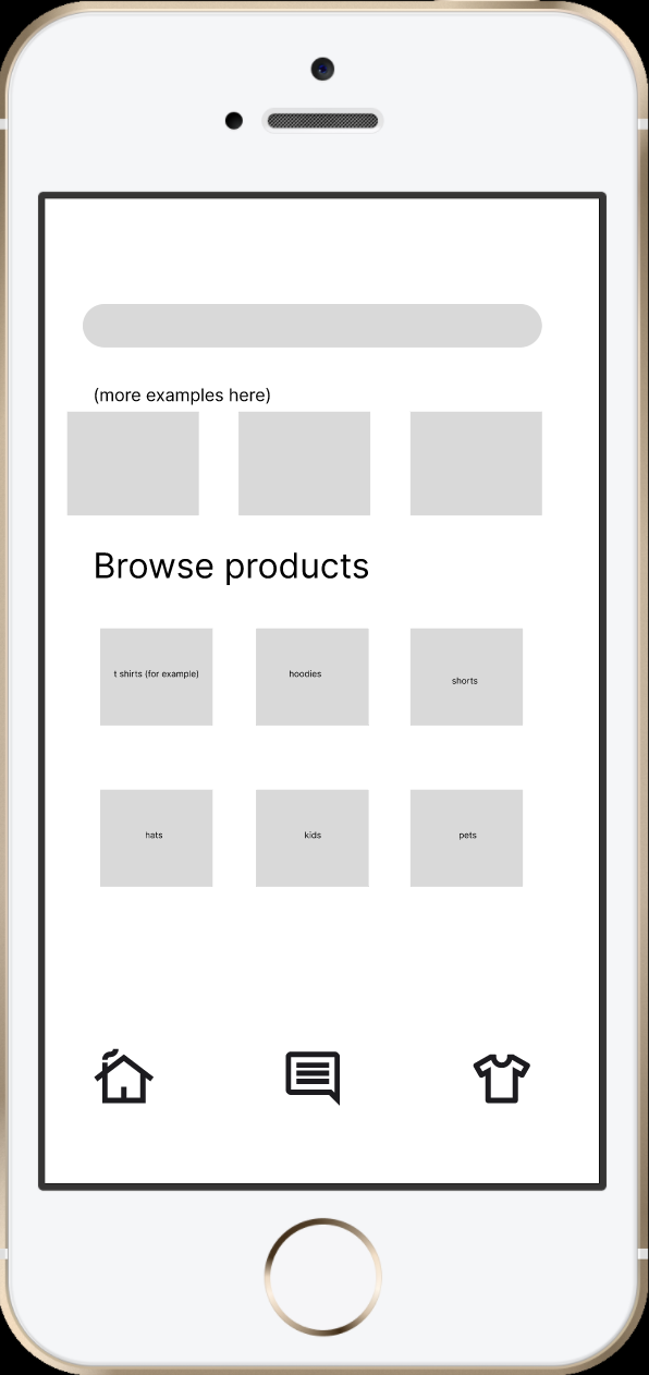
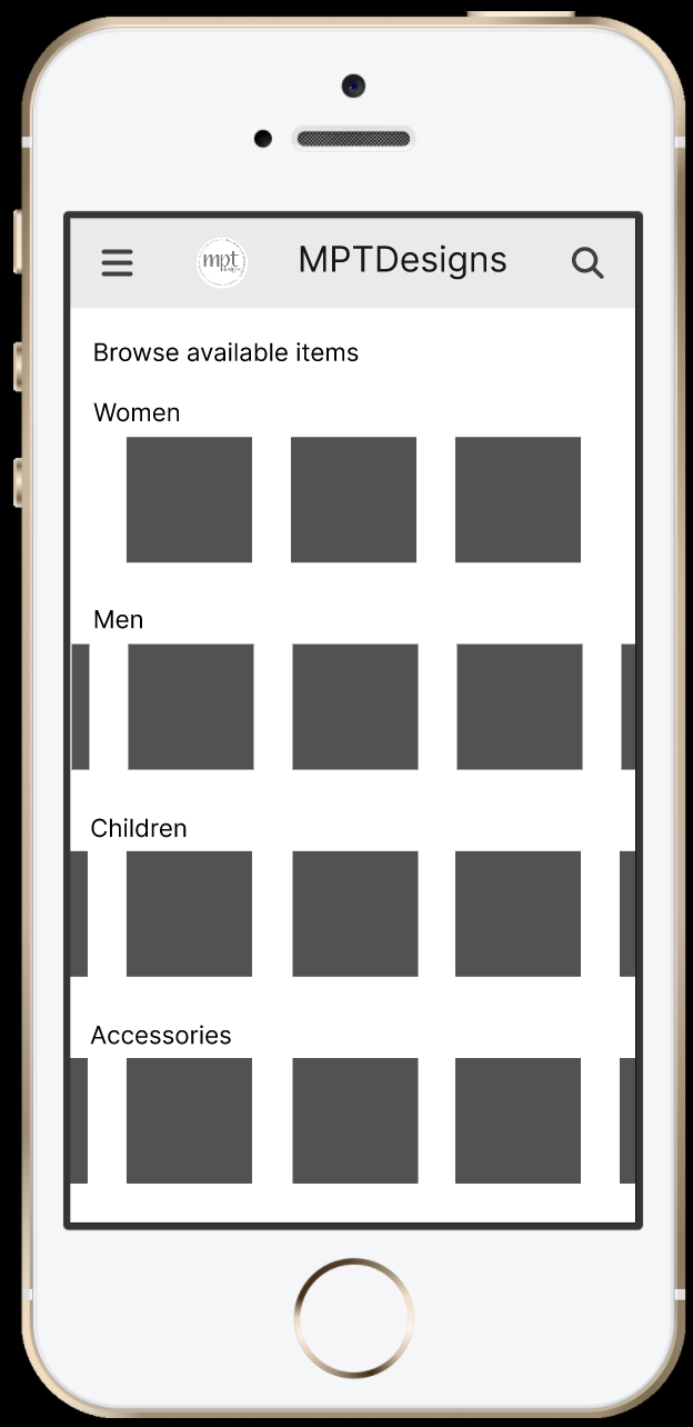
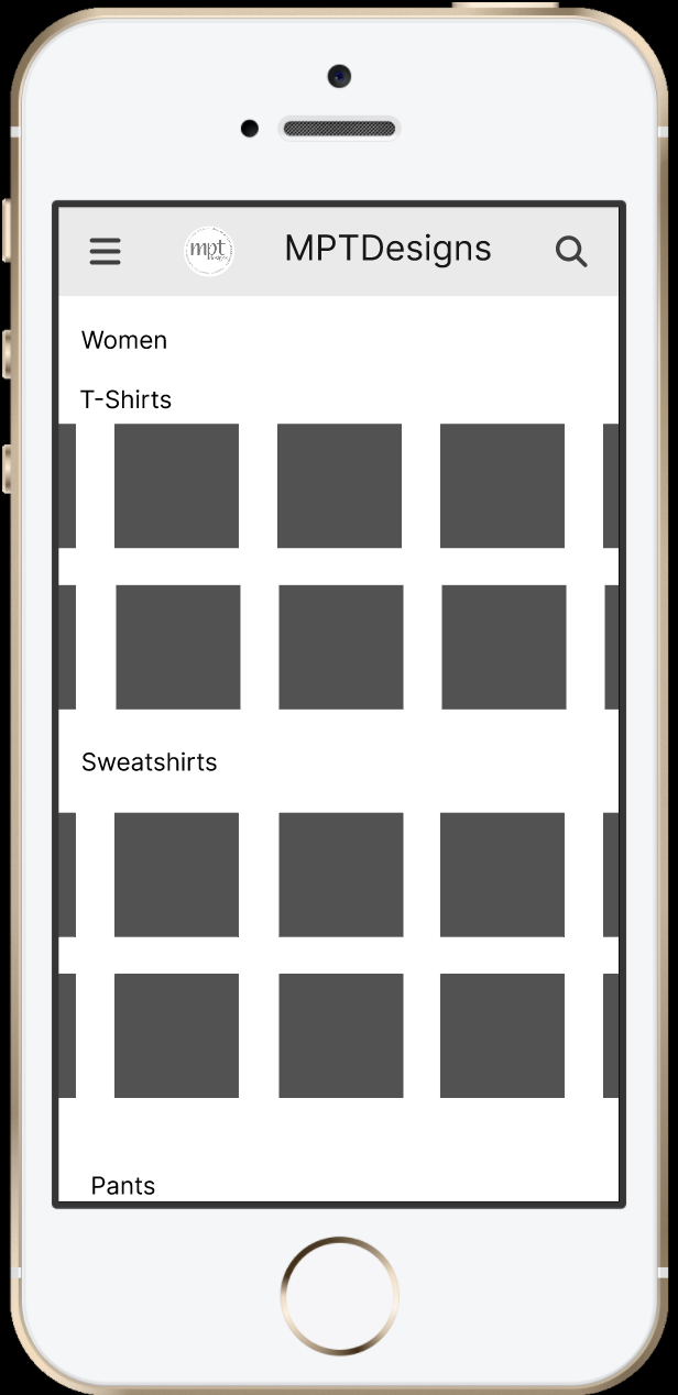
I created three quick concept wireframes to gather early direction from the business owner. Although these initial designs were rough, they helped me understand what wasn’t working, which guided the refined, user-centered layouts that followed.
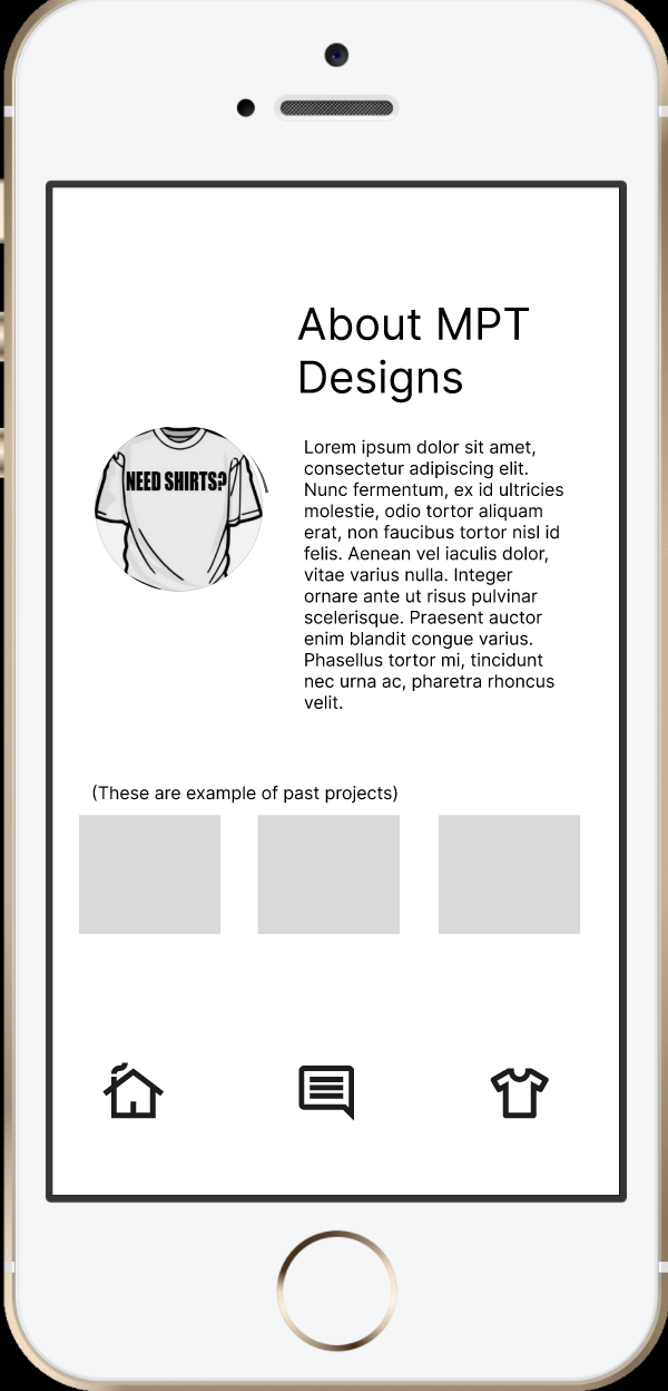
In my initial concepts, I focused heavily on providing users with multiple ways to browse past work. However, after reviewing the owner’s goals and user feedback, it became clear that the website first needed to communicate who the business is and how to get in touch. I advised adding a clear About page to build trust, a simplified Contact page with a strong call-to-action, and an updated search/browse experience that showcases examples of previous work without overwhelming users with too many paths or choices.
These adjustments ensured the site supported the owner’s primary goals, looking professional, being reachable, and converting visitors into real clients, before expanding into more advanced features.
Design Iteration & Continued Development
Lessons learnt

This project gave me hands-on experience working directly with a small business owner and real users. I learned how important it is to balance business goals with user needs, and how important it is to create a site that not only looks professional, but also clearly communicates purpose and drives real action.
I practiced gathering insights through interviews, synthesizing feedback, and translating findings into wireframes that solve actual problems. I also learned the value of early stakeholder alignment, especially when communication becomes limited or project timelines shift.
Although the project paused before final delivery, I genuinely enjoyed collaborating with the business owner and designing for her brand’s future. I plan to continue refining the new website concept and eventually reach back out to share a fully polished version, turning this into a finished product that could truly support her business growth.
Overall, this project strengthened my confidence as a UX designer and showed me how research-driven design can transform a website into a meaningful tool for both users and the business.